Brand Development
V Quip
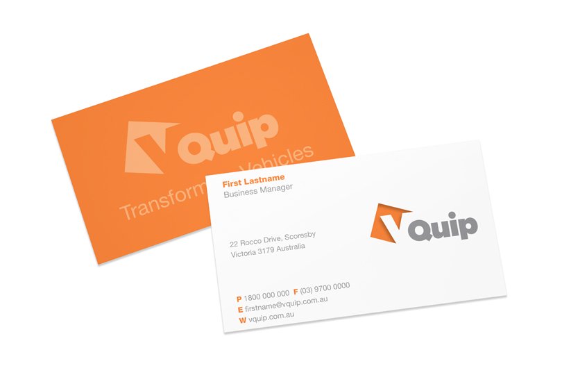
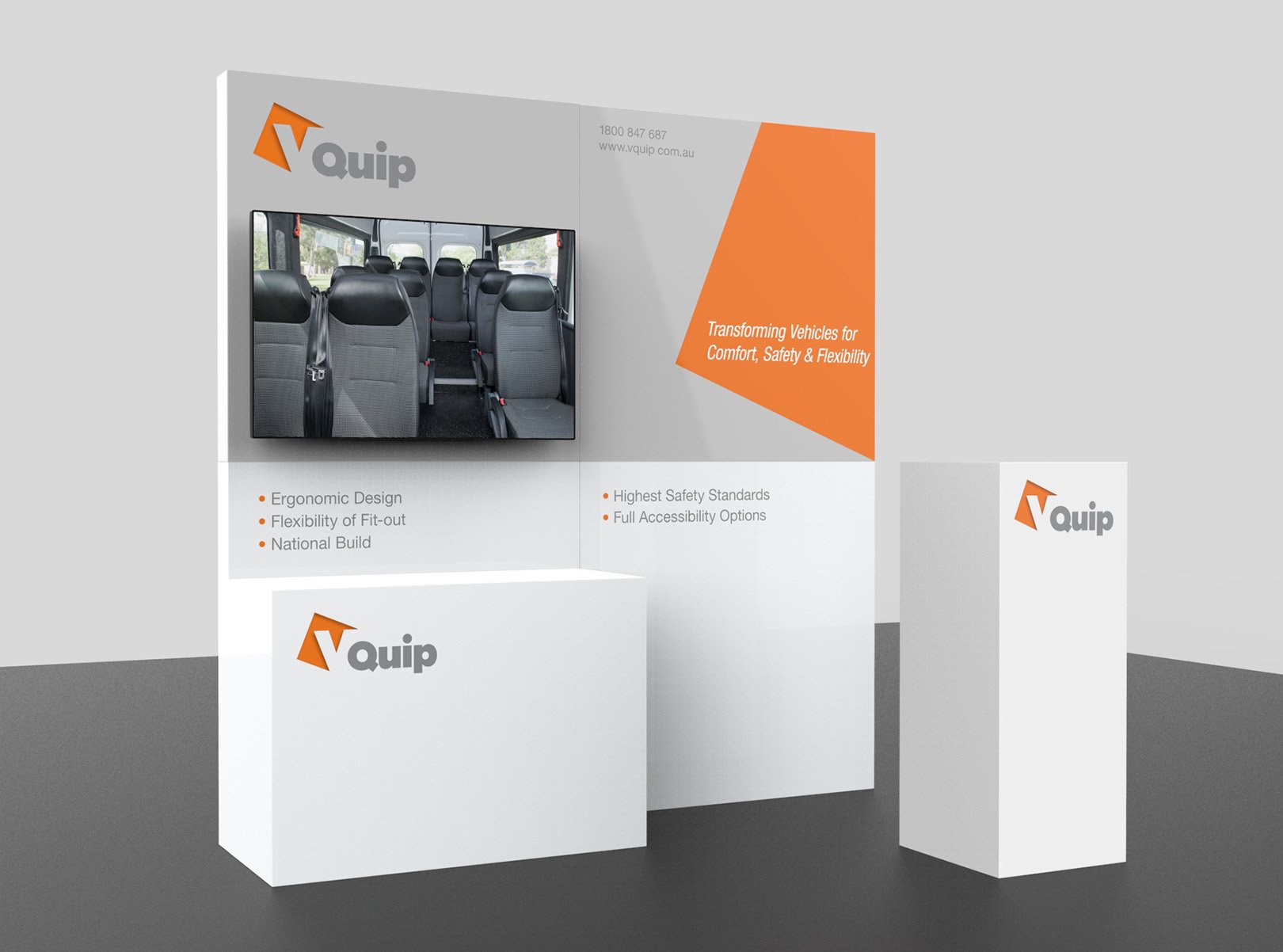
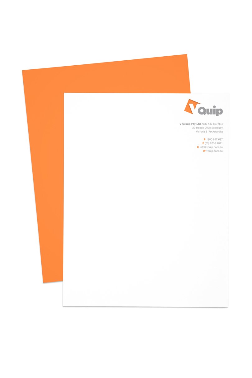
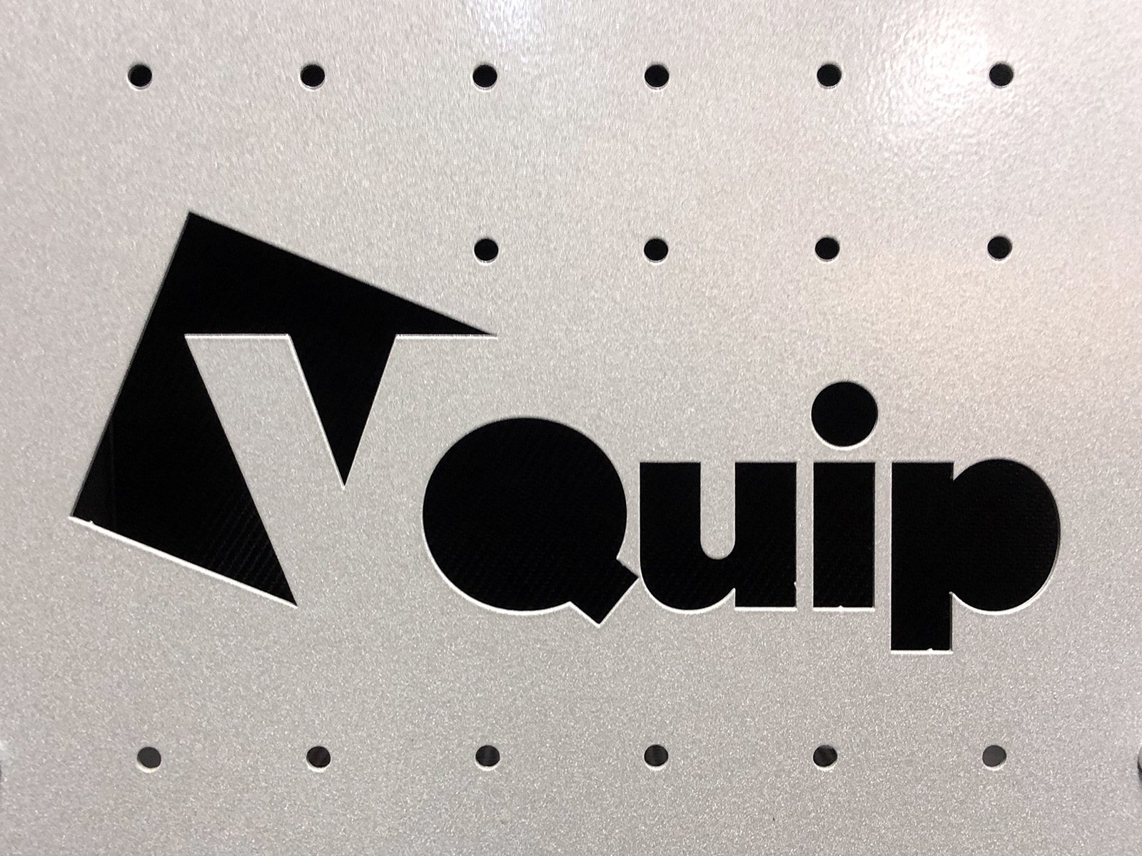
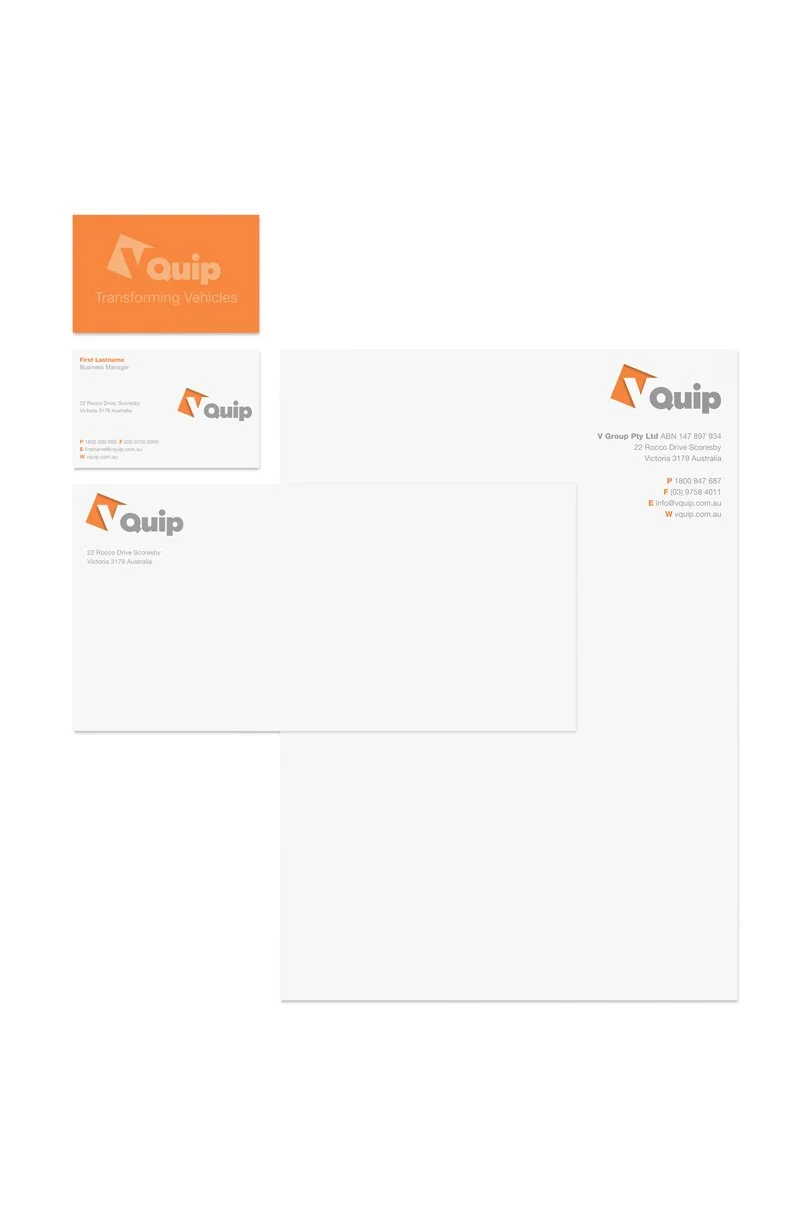
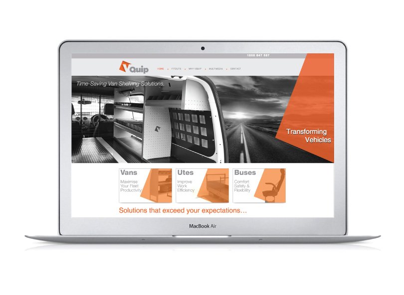
Changing the name from V Group to V Quip required a stronger brand position that would better reflect the focus of the company’s core message – transforming commercial vehicles through intelligent planning, space management and delivery. Consequently, UNO designed a new brand to appear progressive, bold and simply memorable to build a cumulative awareness among the target audience. The final design uses the orange colour, denoting progression, with the V reversed out is representative of working within strict space parameters, one of the unique client USPs.